Country Comfort
•
Country Comfort •
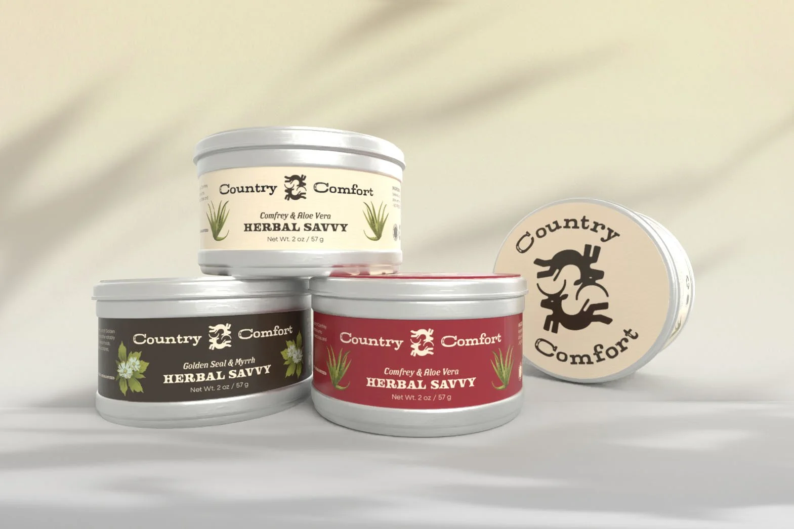
The following work is a redesign of Country Comfort’s herbal creams. As a small company with down to earth values, I aimed to bring character into the packaging that resembles not just the name, but the rustic countryside charm of the company’s origins.
Skill: Illustrator, Photoshop, Adobe Dimension
Timeline: March 2025 -April 2025

Research
The beginning stages of my research involved coming up with a concept that stayed loyal to Country Comfort’s original message and current values. This small brand manufactures their own products and have consistently stayed with a hand-made aesthetic with their soaps, and a very minimal look for their creams. I wanted to stay within the vintage look and experiment with concepts that are synonymous with an earthy Wild West design.


Original Packaging

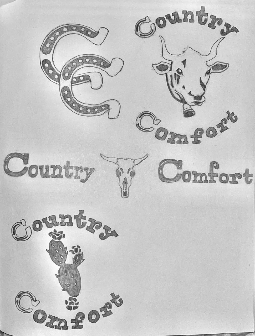
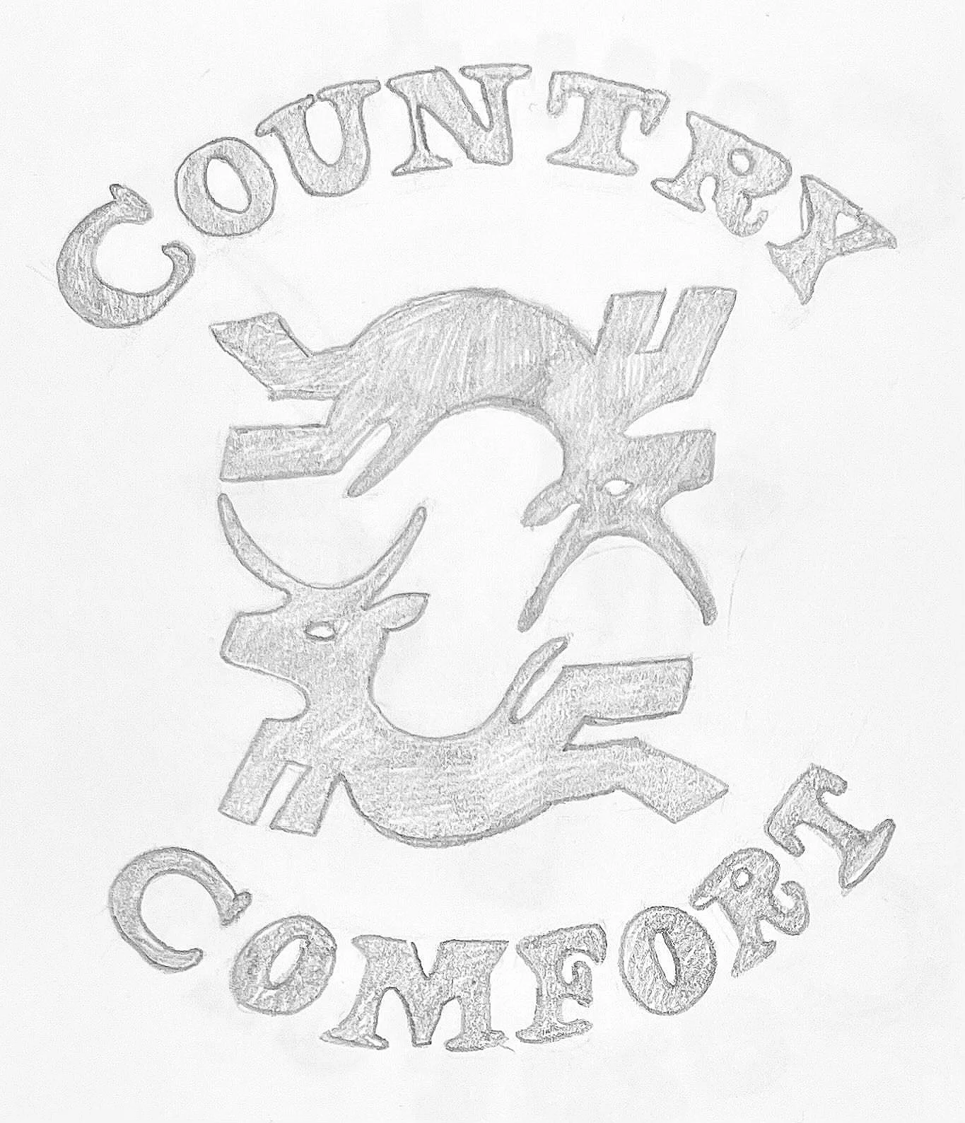
Sketches
The following four sketches focuses the logo redesign. Since all of their products are centered towards treating illnesses and ailments, I wanted to lean towards a logo that isn’t too bold. A softer touch that focuses around animals and nature made the most logical sense.